CoreLoss

Loss Analysis Solution

실시간 데이터와 고급 분석을 통해 생산 과정에서 발생하는 비효율성을 빠르게 감지하고, 워크플로우를 최적화하며, 전반적인 운영 효율성을 높입니다. 이를 통해 비용을 절감할 수 있을 뿐만 아니라, 지속적인 개선과 성장을 위한 기반을 마련할 수 있는 솔루션입니다.

Get a Quote

Use Cases

Boost Productivity with CoreLoss

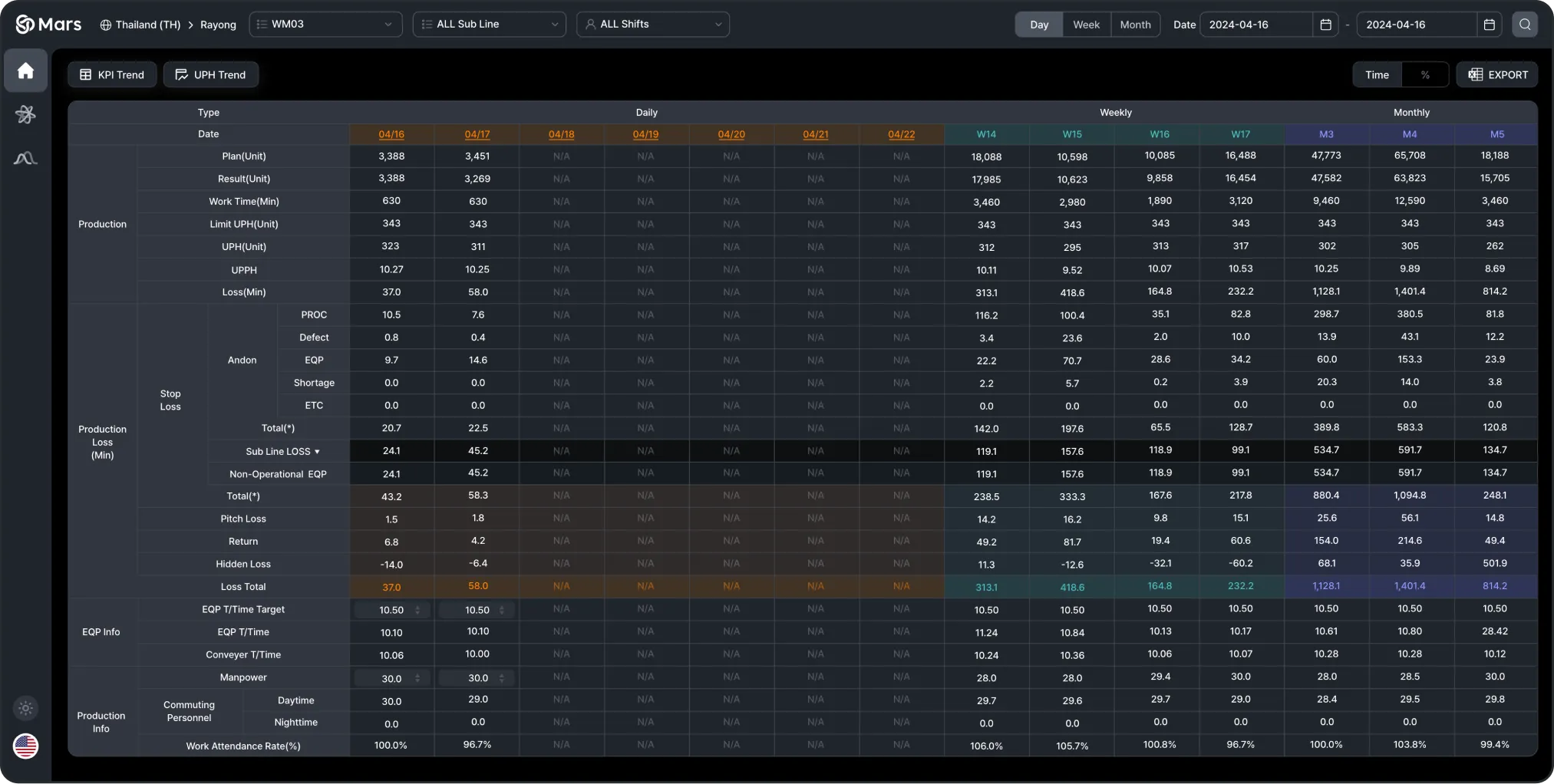
일별/주별/월별 생산 Loss 원인 분석

생산 라인에서 다양한 요인으로 인해 발생하는 손실 시간을 분석 하며, 이를 일별, 주별, 월별로 비교할 수 있는 기능을 제공합니다.

생산 데이터

공정(PROC), 불량(Defect), 안돈(Andon), 설비(EQP), 부족(Shortage) 등

Loss 원인

공정(PROC), 불량(Defect), 안돈(Andon), 설비(EQP), 부족(Shortage) 등

생산 Loss (분)

Sub Line Loss, Non-Operational EQP, Total

설비 정보

EQP T/Time, Conveyor T/Time

생산 관련 정보

출퇴근 인원(Commuting Personnel), 작업 출석률(Work Attendance Rate)

CoreLoss Main Image

UPH 가중치 분석 (생산 모델별)

각 모델 그룹의 생산 효율 데이터를 시각화하여 시간별 UPH, 손실 보상 시간, 생산 시간을 한눈에 파악할 수 있습니다.

모델 그룹별 UPH

시간이 지남에 따라 UPH의 변화를 보여주며, 빠른 생산 또는 느린 생산 기간을 쉽게 식별 가능.

제한 UPH 및 UPH 가중치

각 모델의 UPH를 Limit값과 비교하여 생산성과 손실 보상 시간을 계산.

Loss 보상

총 손실 보상 시간이 계산되어, 어떤 모델이 생산 손실에 기여했는지 파악 가능.
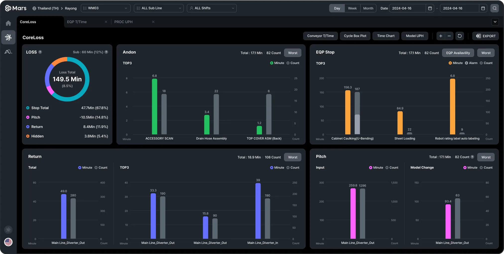
CoreLoss Model UPH Image

5대 무작업 Trend 상세 분석

생산 공정의 비효율성을 식별할 수 있도록 다양한 차트를 통해 시간 손실과 손실 요인을 세분화하여 제공합니다.

Loss 총합

Stop, Pitch, Return, Hidden 유형별 총 손실 시간을 시각적으로 분류.

Andon TOP3

시간 및 발생 횟수를 기준으로 상위 3개의 안돈 이벤트 분석.

EQP Stop TOP3

시간 및 빈도를 기준으로 상위 3개의 설비 정지 원인 분석.

Return TOP3

시간 및 발생 횟수를 기준으로 주요 리턴 원인을 세분화.

Pitch

피치와 관련된 손실 시간 및 빈도를 분석.

CoreLoss Summary Image

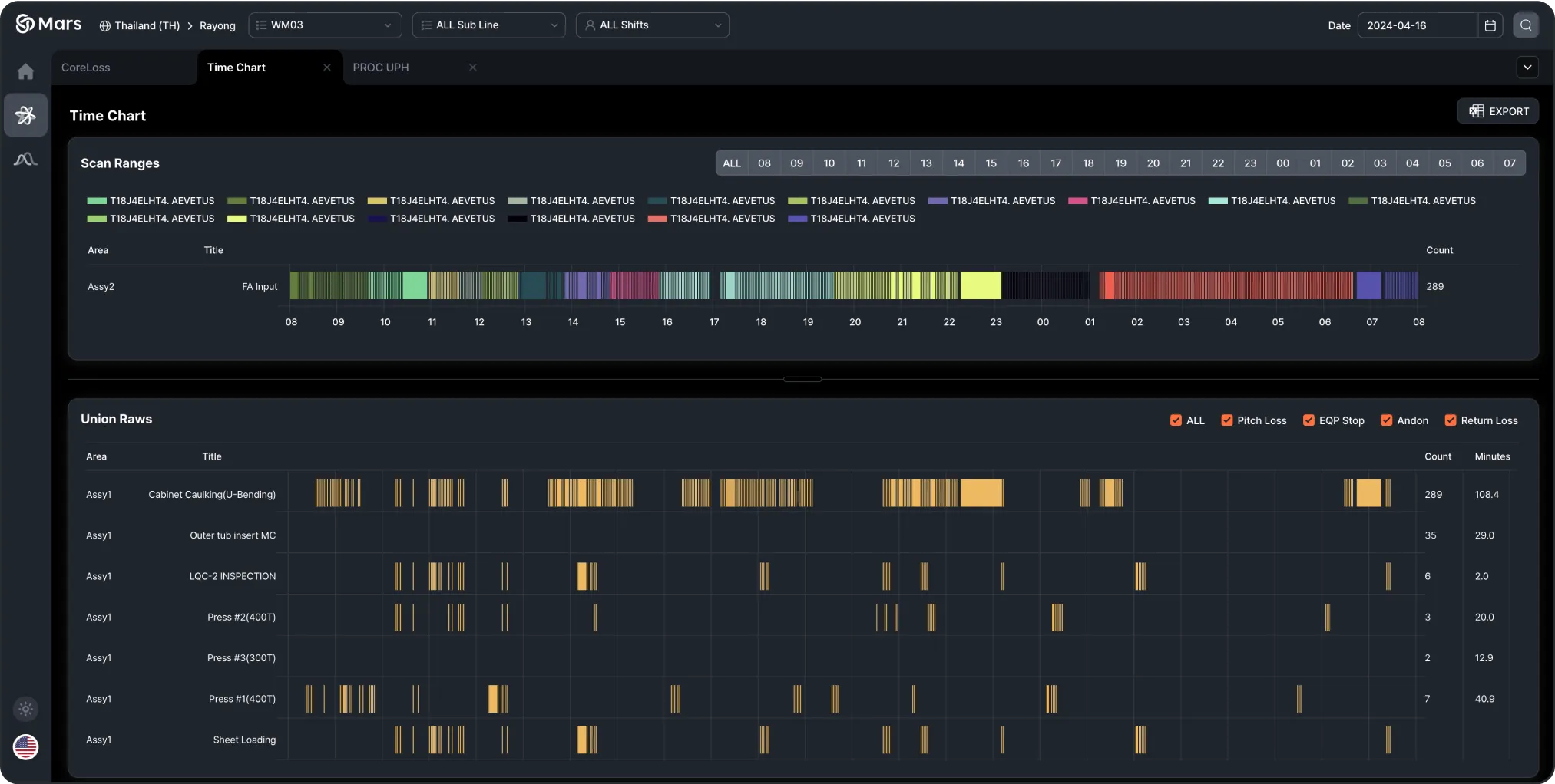
시간대별 실적 대비 LOSS 집계 Report

시간에 따른 생산 성과와 손실을 시각적으로 나타내어 공정의 비효율성을 식별할 수 있도록 돕습니다.

Scan Ranges

시간에 따라 스캔된 범위를 시각적으로 표현하여 특정 생산 작업이 수행된 시점을 확인 가능.

Union Raws

각 생산 영역의 손실 데이터를 시간별로 세분화하여 분석하며, 피치 손실(Pitch Loss), 설비 정지(EQP Stop), 안돈(Andon), 반품 손실(Return Loss) 등 특정 손실 유형에 대한 시간 및 빈도에 대한 세부적인 인사이트를 제공합니다.
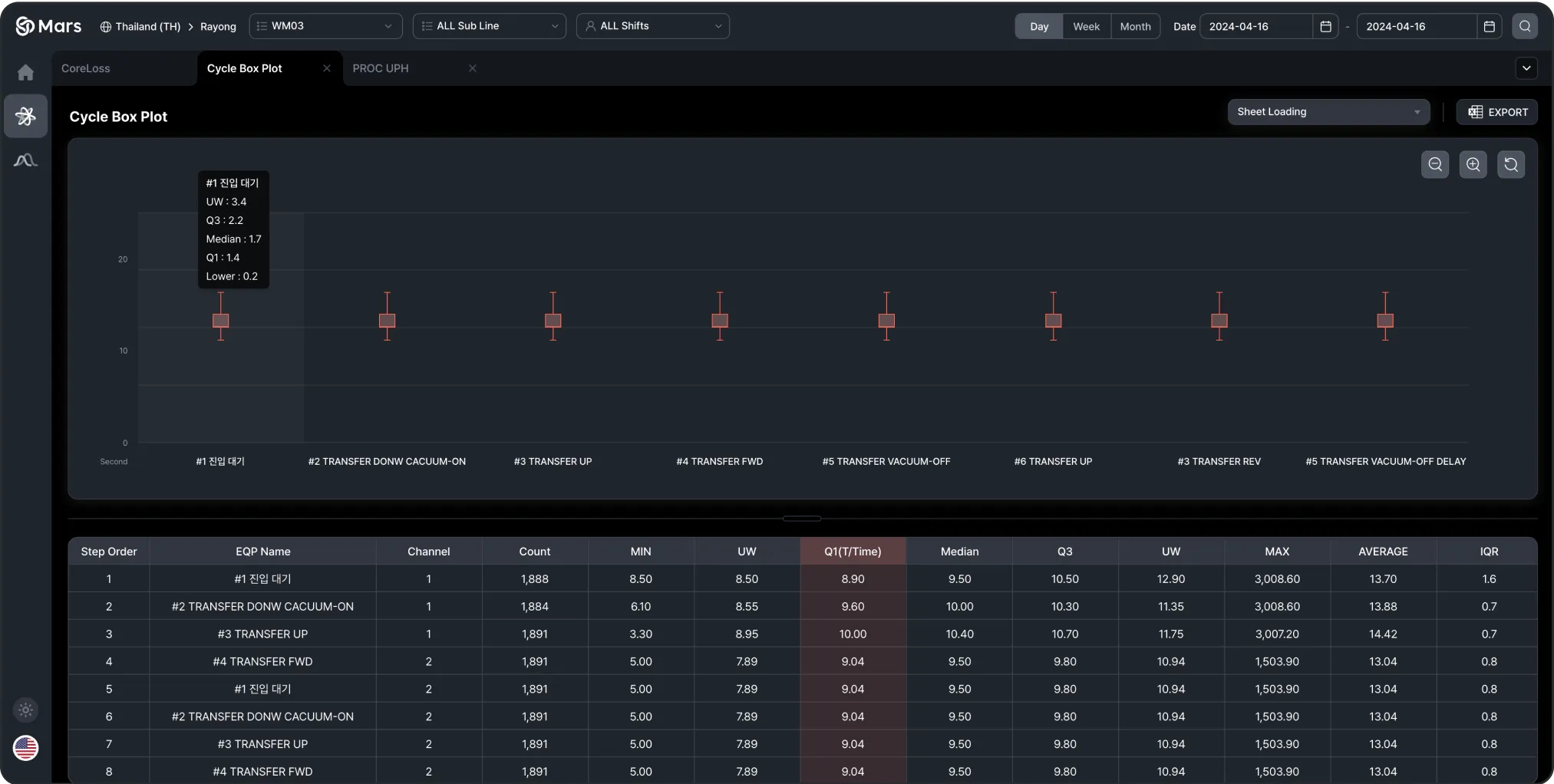
CoreLoss TimeChart Image

설비 동작별 통계 Report

박스 플롯 그래프로 각 작업의 시간 범위를 시각적으로 표현하며, 표에서는 최소값, 최대값, 평균, 중앙값 등의 데이터를 제공합니다. 이를 통해 작업 시간의 비교가 가능하며 비효율성이나 이상 현상을 식별할 수 있습니다.

시간 분포 및 설비 효율 분석

박스 플롯을 통해 각 설비 작업의 시간 분포를 시각화하고, 최소값, 중앙값, 3사분위수(Q3), 최대값 등의 통계 데이터를 제공하여 심층적인 분석 가능.

효율성 평가

작업 반복 횟수와 평균 작업 시간을 기반으로 효율성을 평가하여 설비 성능을 상세히 비교할 수 있도록 지원.

CoreLoss Cycle Box Plot Image

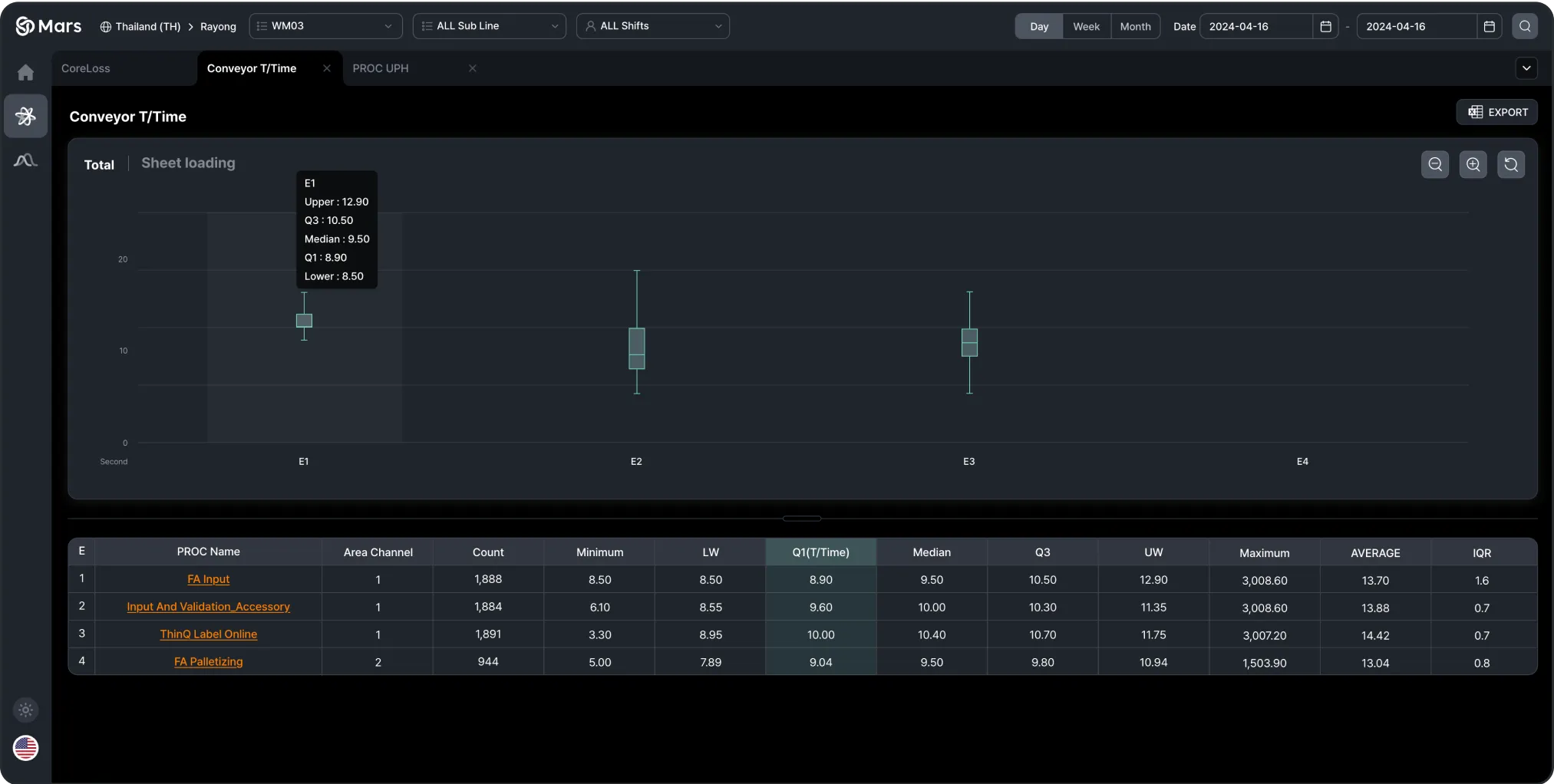
Conveyor, 설비 Tact Time 분석

컨베이어 설비의 Tact Time을 분석하여 각 공정의 시간 분포를 시각적으로 보여줍니다. 박스 플롯을 사용하여 각 공정의 Tact Time을 시각화하며, 테이블을 통해 최소값, 최대값, 중앙값, 평균값 등의 통계 데이터를 제공합니다.

컨베이어 설비의 Tact Time 분포

컨베이어 설비의 Tact Time을 박스 플롯으로 시각화하여 시간 분포를 명확히 파악 가능.

공정 효율성 분석

각 공정 단계의 Tact Time에 대한 최소값, 중앙값, 상위 사분위수(Q3), 최대값 등의 통계값을 수집하여 효율성을 비교 분석.

CoreLoss ConveyorTT Chart Image

CoreLoss

Loss Analysis Solution

실시간 데이터와 고급 분석을 통해 생산 과정에서 발생하는 비효율성을 빠르게 감지하고, 워크플로우를 최적화하며, 전반적인 운영 효율성을 높입니다. 이를 통해 비용을 절감할 수 있을 뿐만 아니라, 지속적인 개선과 성장을 위한 기반을 마련할 수 있는 솔루션입니다.

Get a Quote

Use Cases

Boost Productivity with CoreLoss

CoreLoss Main Image

Daily/Weekly/Monthly Production Loss Cause Analysis

This provides a down of the time lost in the production line due to various factors, with the ability to compare losses on a daily, weekly, and monthly basis.

Check Icon

Production

Plan(Unit),Result(Unit), Limit UPH(Unit), UPH(Unit, Loss(Min)

Check Icon

Stop Loss

PROC, Defect, Andon, EQP, Shortage, ETC

Check Icon

Production Loss (Min)

Sub Line Loss, Non-Operational EQP, Total

Check Icon

Equipment Info

EQP T/Time, Conveyor T/Time

Check Icon

Production Info

Commuting Personnel, Work Attendance Rate

CoreLoss Model UPH Image

UPH Weight Analysis by Production Model

It visualizes production efficiency data for each model group, allowing users to track hourly UPH, loss compensation time, and production minutes at a glance.

Check Icon

UPH by Model Groups

This graph shows UPH changes over time, making it easy to spot faster or slower production periods.

Check Icon

Limit UPH & UPH Weight

Each model’s UPH is compared to its limit to calculate productivity and loss compensation time.

Check Icon

Loss Compensation

The total loss compensation time is calculated, showing which models contributed to the production loss.

CoreLoss Summary Image

Detailed Trend Analysis of the Top 5 Down Times

It breaks down times and loss factors into various charts to help identify inefficiencies in the production process.

Check Icon

Loss Total

Visual breakdown of total loss time by Down types (Stop, Pitch, Return, Hidden).

Check Icon

Andon TOP3

Analysis of the top 3 Andon events by time and occurrence.

Check Icon

EQP Stop TOP3

Top equipment stoppages analyzed by time and frequency.

Check Icon

Return TOP3

Main return causes broken down by time and occurrence.

Check Icon

Pitch

Analysis of loss time and frequency related to pitch.

CoreLoss TimeChart Image

Time-Based Performance vs. Loss Summary Report

It visualizes production performance and losses over time to identify inefficiencies in the process.

Check Icon

Scan Ranges

A visual representation of the scanned ranges over time, showing when specific production tasks were performed.

Check Icon

Union Raws

Loss data for each production area is broken down by time, allowing analysis of specific loss types such as Pitch Loss, Equipment Stops (EQP Stop), Andon, and Return Loss, with detailed insights into the time and frequency of each type.

CoreLoss Cycle Box Plot Image

Statistical Report on Equipment Operation

This screen shows statistical data for equipment operations. Box plots visualize the time range for each operation, and tables provide minimum, maximum, average, and median values. This enables comparison of operation times and helps identify inefficiencies or abnormalities.

Check Icon

Time Distribution and Equipment Efficiency Analysis

A box plot shows the time distribution for each equipment operation, with statistical data (minimum, median, Q3, maximum) provided for deeper insights.

Check Icon

Efficiency Evaluation

Efficiency is evaluated based on the repetition count and average time per operation, allowing for a detailed comparison of equipment performance.

CoreLoss ConveyorTT Chart Image

Conveyor Equipment Tact Time Analysis

This screen analyzes the Tact Time of conveyor equipment, visualizing the time distribution for each process. Box plots are used to display the Tact Time for each process, and tables provide minimum, maximum, median, and average times for each process.

Check Icon

Tact Time Distribution for Conveyor Equipment

Box plot visualizing Tact Time across conveyor equipment.

Check Icon

Process Efficiency Analysis

Statistical values (minimum, median, Q3, maximum) for Tact Time are collected and used to compare efficiency across each process step.

Dot Animation Gif