CoreLoss
Loss Analysis Solution
Leverages real-time data and advanced analytics to detect inefficiencies in production, optimize workflows, and enhance operational efficiency, leading to cost savings and continuous improvement
Get a Quote
Use Cases
Boost Productivity with CoreLoss
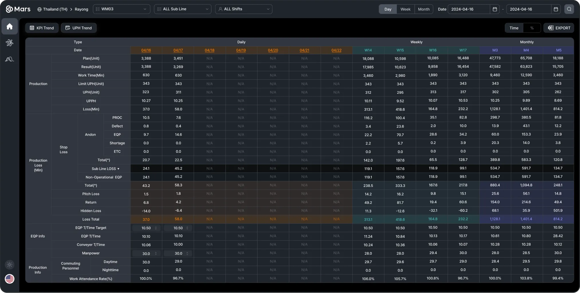
Daily/Weekly/Monthly Production Loss Cause Analysis
This provides a down of the time lost in the production line due to various factors, with the ability to compare losses on a daily, weekly, and monthly basis.
Production
Plan(Unit), Result(Unit), Limit UPH(Unit), UPH(Unit, Loss(Min))
Stop Loss
PROC, Defect, Andon, EQP, Shortage, ETC
Production Loss (Min)
Sub Line Loss, Non-Operational EQP, Total
Equipment Info
EQP T/Time, Conveyor T/Time
Production Info
Commuting Personnel, Work Attendance Rate
UPH Weight Analysis by Production Model
It visualizes production efficiency data for each model group, allowing users to track hourly UPH, loss compensation time, and production minutes at a glance.
UPH by Model Groups
This graph shows UPH changes over time, making it easy to spot faster or slower production periods.
Limit UPH & UPH Weight
Each model’s UPH is compared to its limit to calculate productivity and loss compensation time.
Loss Compensation
The total loss compensation time is calculated, showing which models contributed to the production loss.

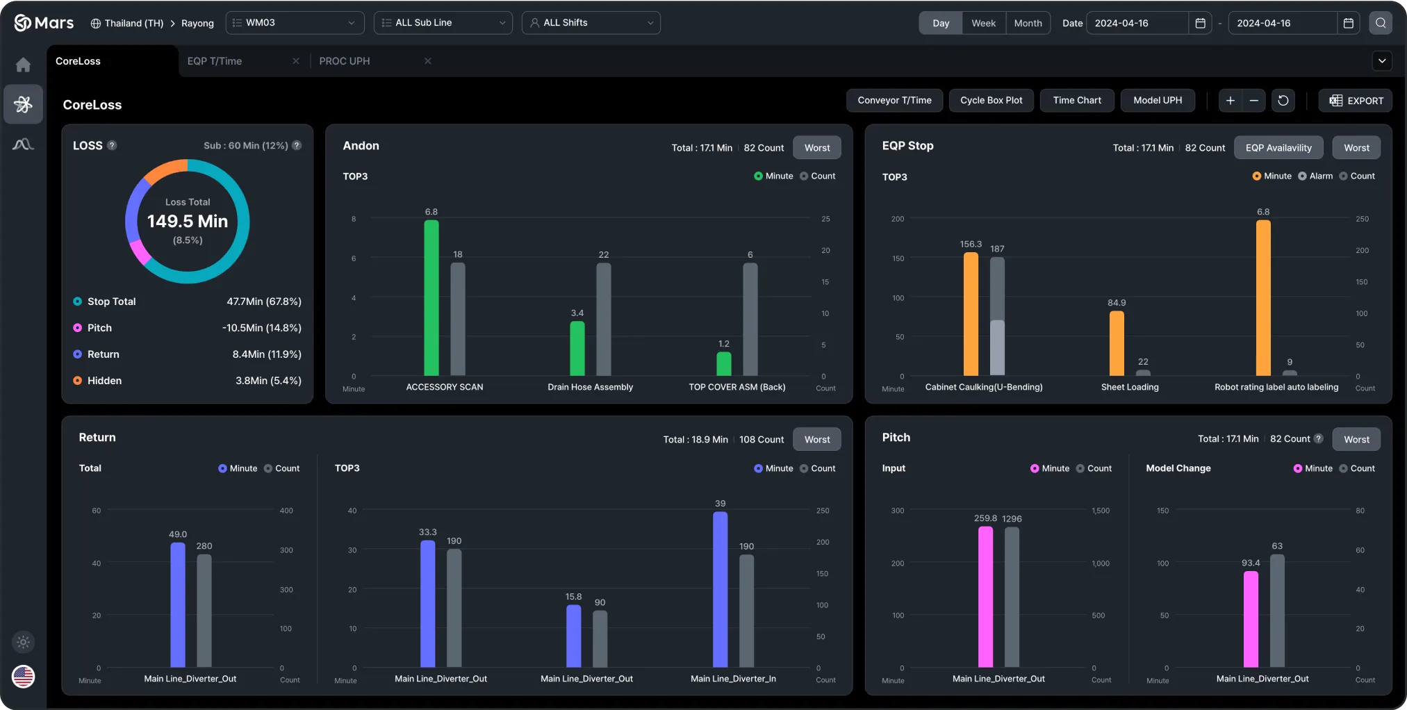
Detailed Trend Analysis of the Top 5 Down Times
It breaks down times and loss factors into various charts to help identify inefficiencies in the production process.
Loss Total
Visual breakdown of total loss time by Down types (Stop, Pitch, Return, Hidden).
Andon TOP3
Analysis of the top 3 Andon events by time and occurrence.
EQP Stop TOP3
Top equipment stoppages analyzed by time and frequency.
Return TOP3
Main return causes broken down by time and occurrence.
Pitch
Analysis of loss time and frequency related to pitch.
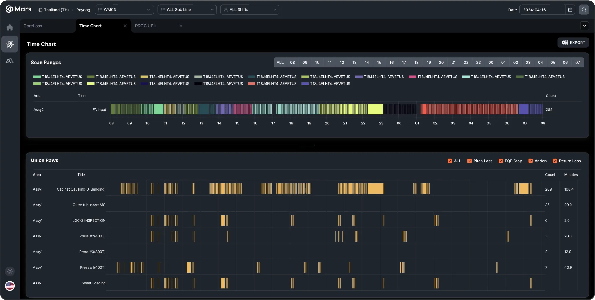
Time-Based Performance vs. Loss Summary Report
It visualizes production performance and losses over time to identify inefficiencies in the process.
Scan Ranges
A visual representation of the scanned ranges over time, showing when specific production tasks were performed.
Union Raws
Loss data for each production area is broken down by time, allowing analysis of specific loss types such as Pitch Loss, Equipment Stops (EQP Stop), Andon, and Return Loss, with detailed insights into the time and frequency of each type.
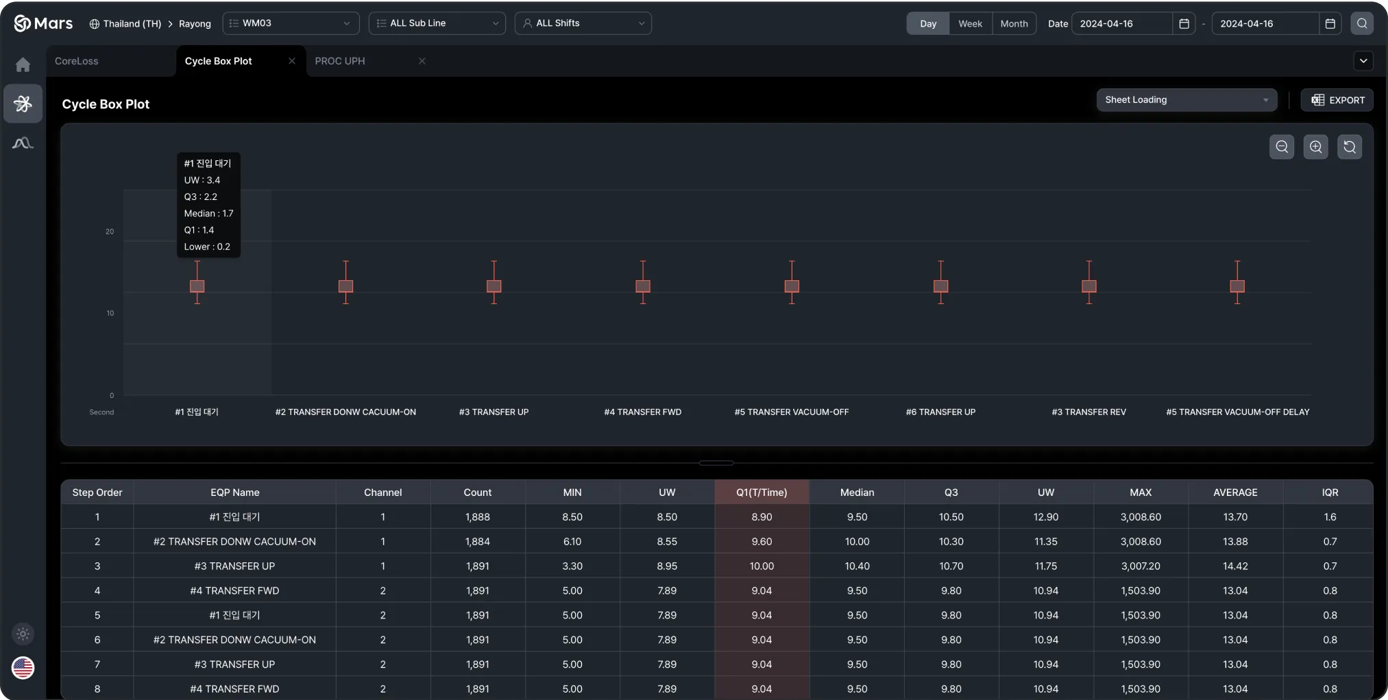
Statistical Report on Equipment Operation
This screen shows statistical data for equipment operations. Box plots visualize the time range for each operation, and tables provide minimum, maximum, average, and median values. This enables comparison of operation times and helps identify inefficiencies or abnormalities.
Time Distribution and Equipment Efficiency Analysis
A box plot shows the time distribution for each equipment operation, with statistical data (minimum, median, Q3, maximum) provided for deeper insights.
Efficiency Evaluation
Efficiency is evaluated based on the repetition count and average time per operation, allowing for a detailed comparison of equipment performance.
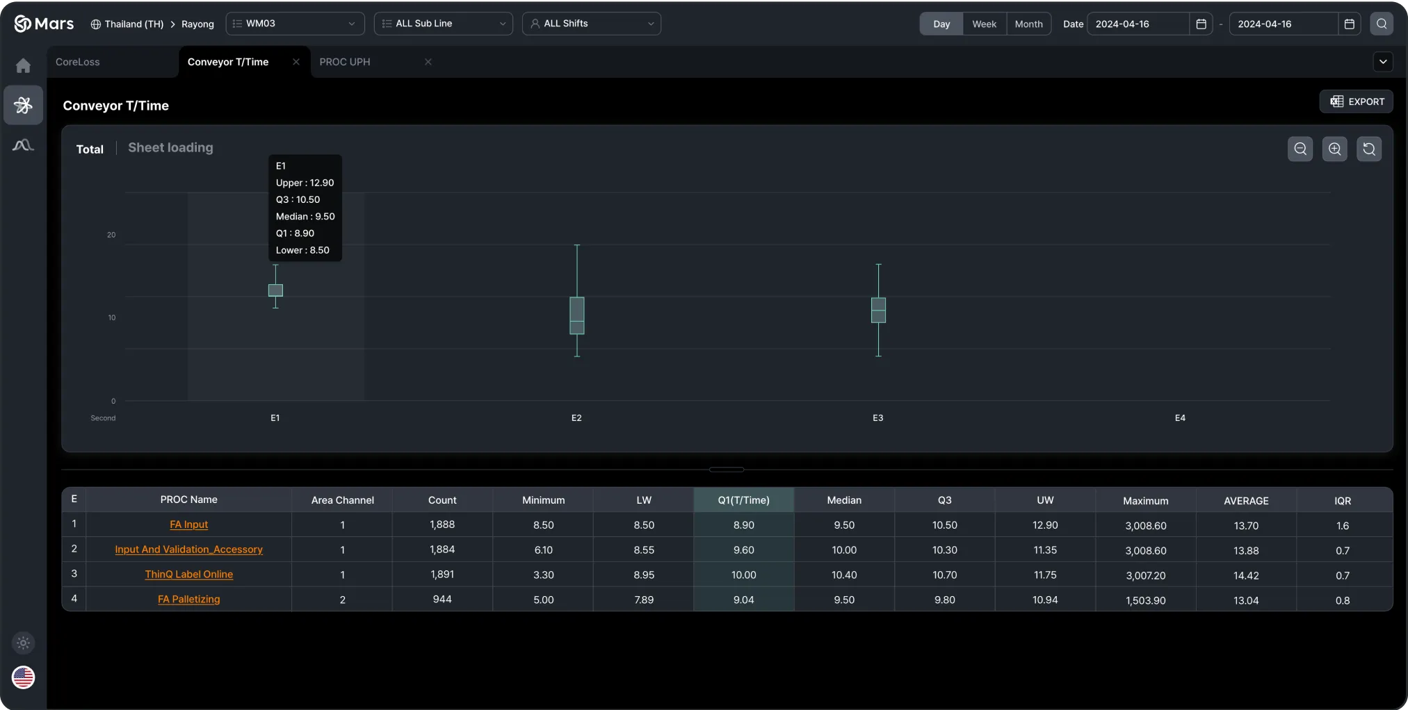
Conveyor Equipment Tact Time Analysis
This screen analyzes the Tact Time of conveyor equipment, visualizing the time distribution for each process. Box plots are used to display the Tact Time for each process, and tables provide minimum, maximum, median, and average times for each process.
Tact Time Distribution for Conveyor Equipment
Box plot visualizing Tact Time across conveyor equipment.
Process Efficiency Analysis
Statistical values (minimum, median, Q3, maximum) for Tact Time are collected and used to compare efficiency across each process step.